
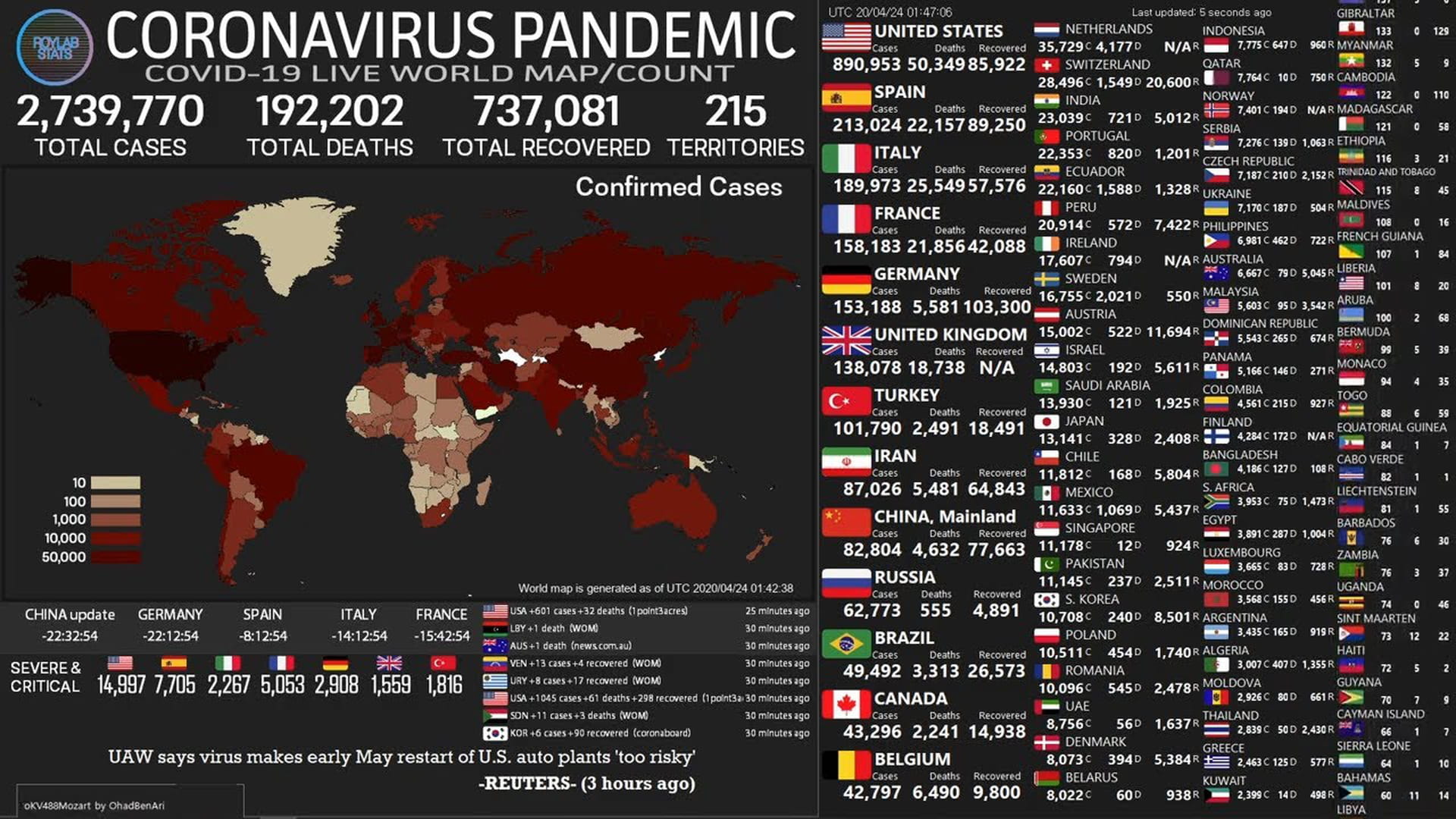
Throughout the world, countries are building "dashboards" to manage the coronavirus crisis. A place where the most important numbers – hospitalisations, testing, the reproduction number, etc – can be found, preferably per region.
Germany has one, on which you can follow the developments in each federal state.
Hong Kong has one, on which you can even view individual cases, including gender, age, place of residence and whether it’s an "imported" or "local" case.
Wales has one and plans – as if the dashboard isn’t enough of a traffic metaphor – a "traffic light" system that shows what state the country is in.
And now the Netherlands has also announced plans to build a dashboard. With "meters" and "warning lights" to guide policy.
Is such a dashboard a good idea? Sure, but under three conditions.
Be honest about the data’s shortcomings
Often enough, the data on such a dashboard has already been lying around on the internet. Bringing all the numbers together in an orderly manner is not a bad idea.
But it’s clear by now that coronavirus figures are not always reliable. For example, both cases and deaths are invariably underestimated because not everyone with complaints is tested. And then there are the people who don’t even notice that they carry the virus.
There are the other shortcomings that are worth repeating, such as a lag in the figures because of reporting delays by hospitals and health authorities.
There are other reasons the figures aren’t as accurate as you would like them to be, like did someone die of coronavirus or with coronavirus? That affects the number of deaths. And when exactly did someone get sick? That can’t always be said, but is important for the calculation of the reproduction number.
Long story short: there are always issues with such figures. That doesn’t make them useless, but it does mean that you have to be careful when interpreting them.
Because the figures are not as precise as some data dashboards suggest. This YouTube dashboard really rattles me.
Any dashboard should be clear about such shortcomings.
By reporting that the last few days’ data is not complete (or by omitting that data altogether).
By showing a moving average, in order to prevent people from relying on a daily whim.
By indicating on the dashboard that a number like the reproduction number always lags behind the current situation.
This all sounds boring and vague, but there are plenty of people who understand good science communication. You can create appealing graphs without making things simpler than they should be.
But even then ...
Don’t drive blind on the dashboard
It’s like driving a car. You’ve got your odometer, your rev-counter, your fuel gauge. But when you’re driving, you’re not just staring at those needles. You watch the road and the traffic around you.
It’s the same with a Covid-19 dashboard. As tempting as it is to let those numbers tell you what to do, you have to look around and use your common sense.
Take the reproduction number, the most important number of the pandemic. It’s often said that if that number rises above 1, measures should become stricter again. But it is important to ask yourself: why has the number risen?
First of all, there is always noise in data. Sometimes a number is a bit higher, sometimes a bit lower. Just by chance. Because reality is not always neatly in line. That’s why it’s always useful to look at the reproduction number of several days to see if there is a structural change.
Then it is also true that if there are fewer cases, the influence of one outbreak on the reproduction number can be large. Is there one "superspreader" who has infected many people? In that case, it would be wiser to isolate that person and trace their contacts, rather than lock up the whole country again.
Another example. Recently, the "R" crawled up in Germany, but the meat industry probably played a role. Hundreds of contaminations have been found in German slaughterhouses. One slaughterhouse even had 260 cases. In such a case, it is better to tackle that particular industry than to impose stricter measures on the entire country.
If the reproduction number structurally exceeds 1 and is driven by an increase in cases throughout the country, then there is certainly reason to reintroduce stricter measures nationally.
As you can see, a figure is informative, but never tells you the whole story. You always have to understand the context.
But even then ...
Recognise that decisions are always political
At the beginning of the crisis, the situation was clear. Countries throughout the world had to jam on the brakes to make sure that care was not overburdened and that the vulnerable in society were protected.
In the meantime, there’s been more and more grumbling. The sports school owner wants to reopen his business, the expert thinks that the contact-tracing research should first be in better order, and everyone wants to go on holiday but thinks the rest should stay at home.
And the stupid thing is, there’s no one right answer because the ultimate policy is the result of weighing up all kinds of interests.
There is the importance of public health, which in itself is not unambiguous. Measures that are good at combating the virus, like staying at home, might cause people to move less and smoke more. Not to mention the effects on mental health.
Moreover, public health is not the only thing that determines the quality of life and society. It’s also about social contacts, about decent work, about self-realisation ... These are all interests that cannot be read from a dashboard.
The consideration of all these interests cannot be made objectively. That is ultimately a political decision. How do the interests outweigh each other? How much risk do we dare to take? What kind of country do we want to be?
The danger of a dashboard is that it appears to be a technical solution to a political problem. A dashboard is not going to decide for us how to make the complicated trade-off between all those things we consider important.
We have to do that ourselves.
 Want to stay up to date?
Follow my weekly newsletter to receive notes, thoughts, or questions on the topic of Numeracy and AI.
Want to stay up to date?
Follow my weekly newsletter to receive notes, thoughts, or questions on the topic of Numeracy and AI.