
Hi,
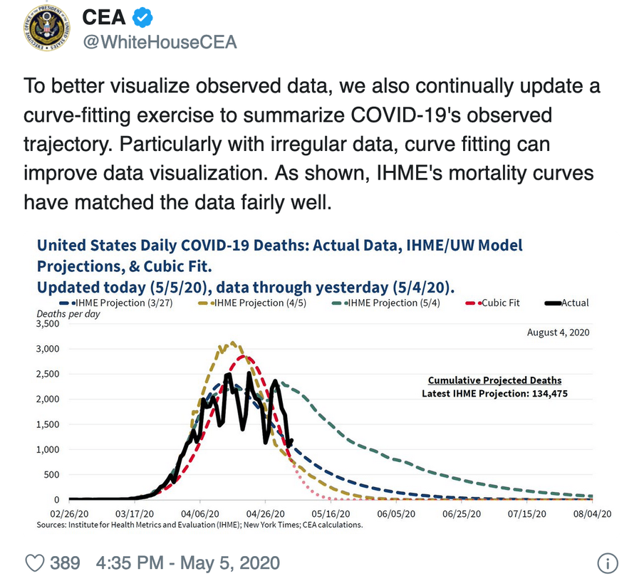
Last week, the White House Council of Economic Advisers (CEA) tweeted the following chart:
Twitter was bursting at the seams with discontent. Or, well, the corner of Twitter where I like to hang out.
"Everyone on even-remotely-stats-adjacent Twitter is appalled at this", wrote Laura Bronner (who’s a "quantitative editor", a job I’d never heard of but am already a fan of).
"This might be the lowest point in the 74-year history of the Council of Economic Advisers," said Harvard professor Jason Furman. Interesting detail: Furman was chairman of the CEA under Obama.
Uproar, fuss ... but what exactly was the problem?
Red numbers
Okay, let’s take another look at the graph. It’s about the number of Covid-19 deaths. The black line represents the actual data, the rest are projections.
At first, I thought that black line was the culprit. Did they just draw that with Paint? It’s not aesthetically pleasing, but that wasn’t the issue with this picture.
The blue, yellow and green lines are based on the model of the IHME. That’s the Institute for Health Metrics and Evaluation at the University of Washington, Seattle, a key adviser on Trump’s policy. These days, the IHME gets a lot of criticism from epidemiologists, but that wasn’t the problem here either.
So what was the outrage about? The red line – the "cubic fit".
Fitting
The idea behind that cubic fit is to draw a smooth line through that black line – the actual data on deaths. That’s not a crazy idea in itself given that daily data can be erratic. By chance, the number will sometimes be a bit higher and sometimes a bit lower. If you "fit" a line through those data points, you can get a better idea of the general pattern.
But then the question is: which line? You can draw many different lines across the same data, as cartoonist Randall Munroe aptly showed in this xkcd comic.

There’s always a danger that you’re going to "overfit", as in the bottom left corner of the comic. If you do that you follow the data too precisely, and you also include the noise that you wanted to filter out in the first place.
This is especially risky with data like that of Covid-19 deaths. Just look at the black line in the CEA graph: it moves up and down like a rollercoaster. Nobody believes it represents the real deaths. The drops in the graph are on Sundays, like 26 April for example. That’s because less data is recorded over the weekend.
So, if we’re to believe the legend, the CEA chose the cubic fit. A linear fit is a straight line, a quadratic fit is a parabola and a cubic fit goes one step further. It follows a polynomial function of the third degree. If you don’t know what that is, the most important thing is: the line gets a little more freedom to bend in some places.
But does that CEA graph really show a cubic fit? Epidemiologist Carl T. Bergstrom stated that it was actually a cubic spline, a slightly more complicated way of fitting. Sociologist Kieran Healy believed that a cubic fit would become negative in May, and suggested they had drawn a few dots by hand at the end of the curve. Bergstrom came back later with the remark that they had taken the exponential of a quadratic function.
Oh, the nooks of the Internet ...
Just excelling is not enough
But it doesn’t really matter what the exact method was, because just fitting a line on this kind of data is idiotic in any case. You have to make assumptions about what the data looks like. How were the figures collected? Why are there peaks and troughs? Where’s the noise coming from? How much is being tested?
This is really more complicated than using a standard function in Excel. You need an epidemiological model for that.
In this case it is extra damaging, because the line gives the impression that the number of deaths in the US will be zero by mid-May. That seems very unlikely. Although the CEA later stated that it was not intended to make a prediction. But that is how it was read by many twitterati.
As Bronner stated: "I think a lot of the frustration here is that this hugely policy-relevant model seems like it might be based on something my third stats class told me not to do [ ... ]."
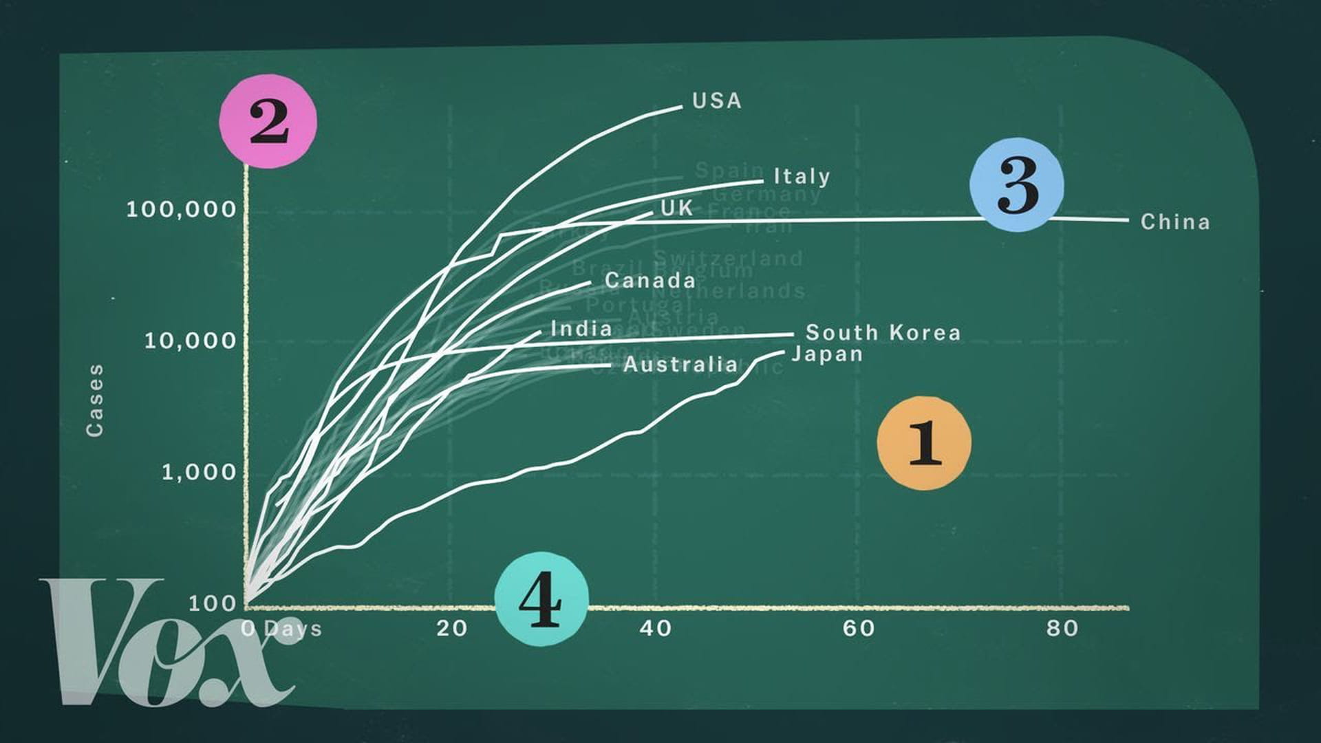
So, pay attention when you see a corona chart. This Vox video explains very well what can go wrong with another much-seen graph.
#coronafree
Yesterday, Florence Nightingale would have been 200 years old. You may know her as the most famous nurse in world history. But she was also something else: a number nerd.
Nightingale was one of the first people to use charts for social change. With this infographic she showed that during the Crimean war most soldiers did not die of war, but of diseases that could have been prevented. What was needed was more hygiene in the barracks.
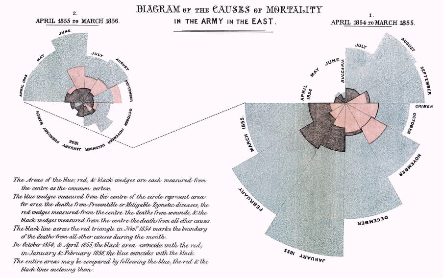
Nightingale finally managed to convince the authorities with her figures. By the 1880s many problems were solved: soldiers got better food, had more opportunities to wash themselves and their barracks were cleaner than ever.
With this she showed: you can save lives with numbers. Today that’s more relevant than ever.
Would you like to read more about this? This article from a few years back tells you all about it. I also write about Nightingale extensively in The Number Bias, coming out this summer.
Before you go ...
I wrote in my previous newsletter about the reproduction number R, the most important figure of the pandemic. I have now extended the text to an explainer.
 Prefer to receive this newsletter in your inbox?
Follow my weekly newsletter to receive notes, thoughts, or questions on the topic of Numeracy and AI.
Prefer to receive this newsletter in your inbox?
Follow my weekly newsletter to receive notes, thoughts, or questions on the topic of Numeracy and AI.