
Hi,
But what is K?
It was a popular question after my piece about this number. And it was true: I didn’t explain what it was.
I referred to Adam Kucharski, who provided a rule of thumb in The Guardian. “The general rule is that the smaller the K value is, the more transmission comes from a smaller number of infectious people [ ... ]”, he said. "Once K is below one, you have got the potential for super-spreading.”
And the corona virus has such a K value below 1. So, there is a chance of super-spreading the virus. It is estimated that between 10 and 20% of infected people are responsible for about 80% of the infections.
That was the most important message of my piece: in policy we have to take that fact into account, for example by quickly suppressing clusters.
But the question remains: what exactly is K? It’s less intuitive than the reproduction number. In order to avoid a technical digression I chose not to explain precisely what K is in the article.
But in this newsletter we are not averse to a bit of technical stuff. So, here we go.
What the reproduction number reveals
As I explained in the piece, the reproduction number is an average. It is important to measure the spread of a virus, but it ignores the differences between people.
To measure that variation, you need another measure: the "dispersion" parameter. To do this, you first need to list the data of secondary infections. This can be done, for example, by contact tracing.
For each person you look at how many others they infected. Suppose you have a disease that spreads very regularly: each person infects three people. Below you can see, with a fictitious example with a hundred people, that the secondary infections are very clustered.
But now a different scenario: 80% of the people don’t infect anyone, while 20% each infect 15 people.
Now you see more dispersion: the graph runs from 0 to 15.
These two examples show the treacherous nature of the reproduction number. Because in both cases the R is equal to 3. On average infected persons in both scenarios infect three others.
In scenario 1, 100 people each infect three people. That makes 300 secondary infections, spread over 100 people. Voilà: an average of three.
In scenario 2, 80 people do not infect anyone at all. 20 people each infect 15 people. That makes 300 secondary infections in total (20*15=300). If you spread this over 100 people, you – again – get an average of three.
But that same reproduction number conceals very different worlds.
A skewed distribution
In reality, the population seldom divides so neatly into two buckets. Below you can see an example of a study in Hong Kong on the coronavirus, from an article in Nature Medicine by Dillon Adam and co-authors.
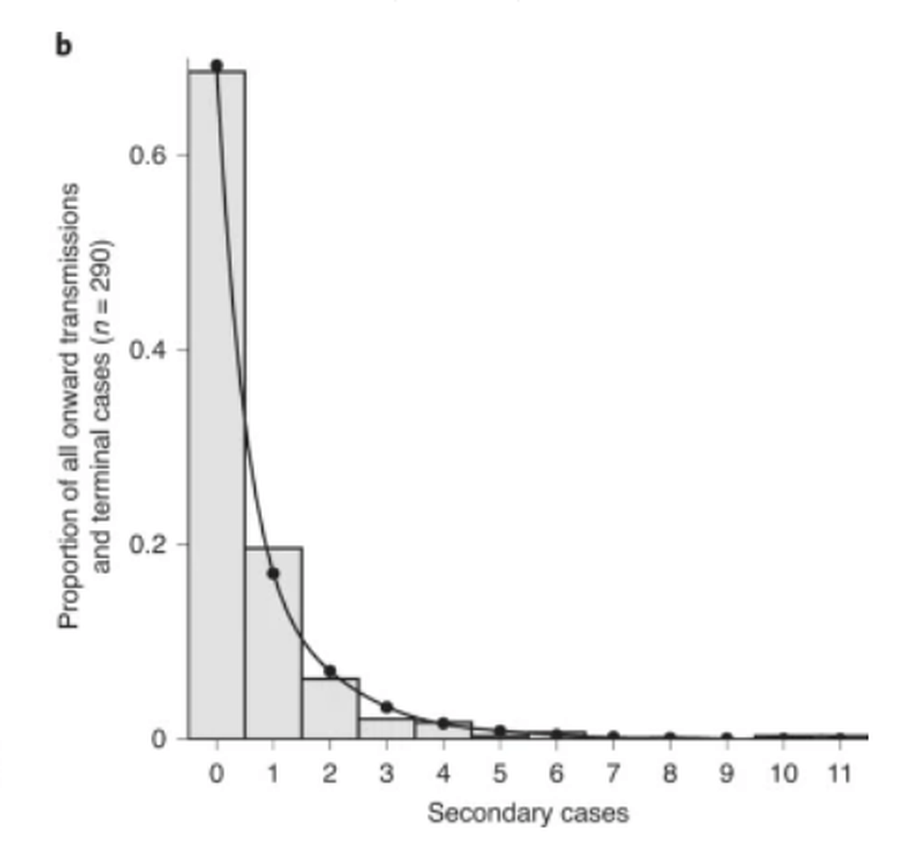
(This time it is not the number of persons on the vertical axis, but the proportion. That does not make the interpretation much different).
Again you see a "skewed" distribution, with many people infecting few others and a couple of outliers infecting many others.
What researchers do next is measure a number of characteristics of that distribution. They take the average but also want to measure the dispersion. To do this, they draw a line through those bars, as you can see in the picture of Hong Kong.
They try to draw the line in such a way that it corresponds to a distribution that is already known. There are a lot of those out there. Maybe you’ve heard of the "normal distribution", with a bump in the middle and offshoots to the left and right.
For example, body height for women or men is normally distributed: a lot of people cluster around the average, with some tall and some short people around them.
But this distribution clearly does not fit the distribution of corona infections. It is skewed, not symmetrical like a normal distribution.
Negative binomial distribution
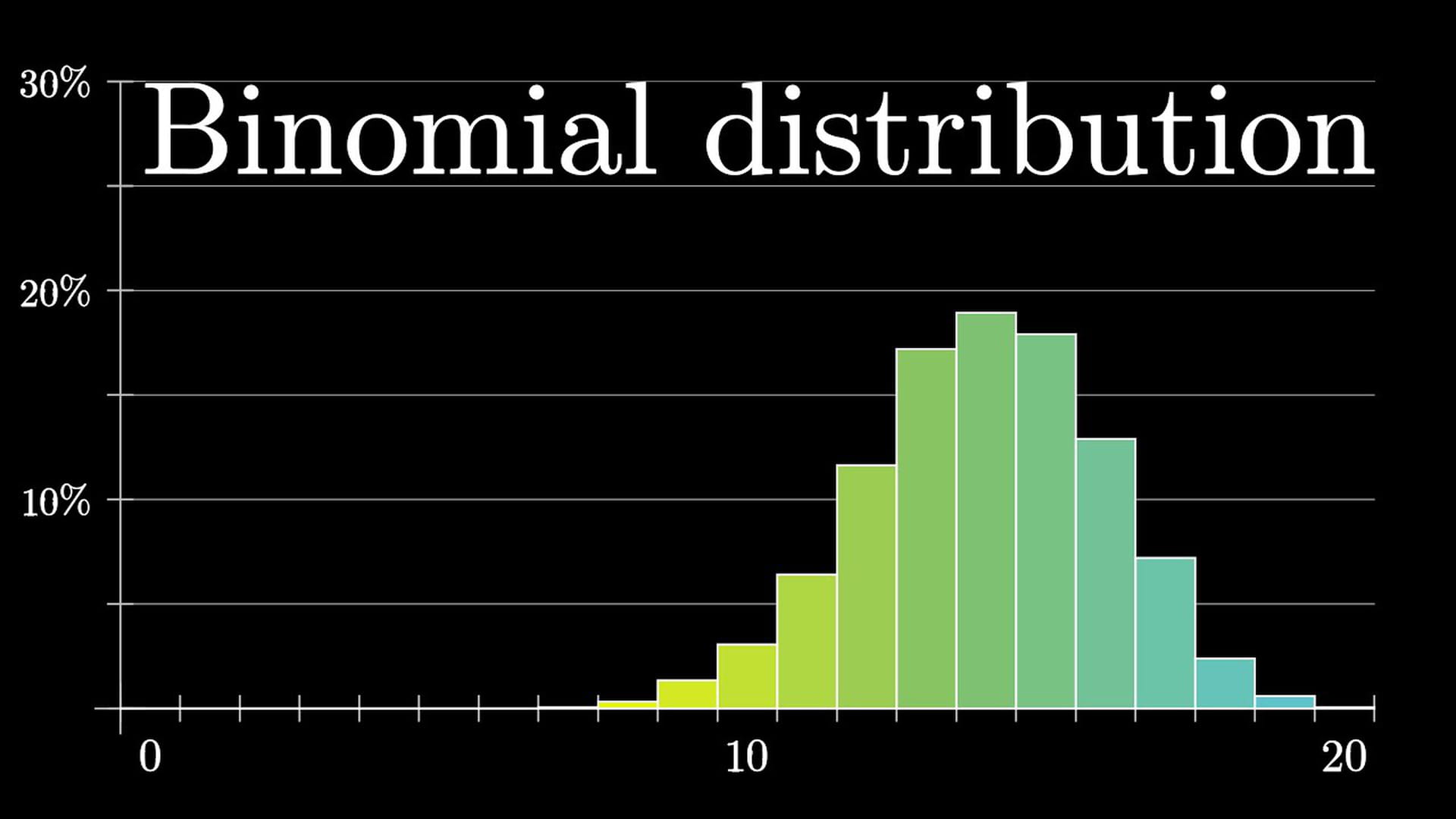
Epidemiologists prefer to use a different distribution: the negative binomial distribution. On Wikipedia you can read more about it, including some more mathematics.
The negative binomial distribution is a variation on – surprise – the binomial distribution, about which the great YouTube channel 3Blue1Brown made a good video.
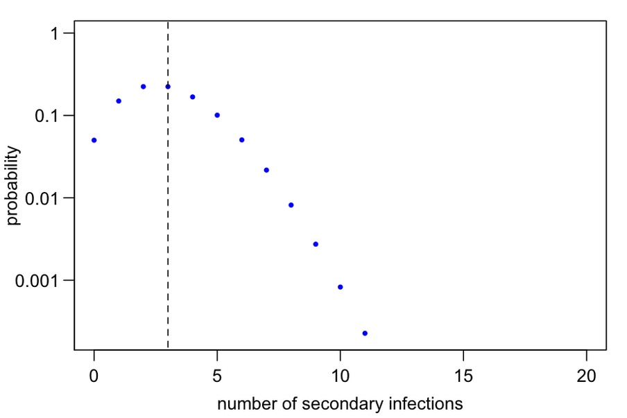
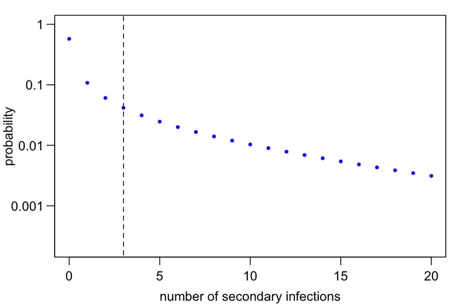
For now, let’s say that the negative binomial distribution has a shape that fits well on the graphs above and that there are two knobs we can turn: the average (R, the reproduction number) and the distribution parameter (K).
Let’s keep the average on three, as in the previous example. Adam Kucharski showed on Twitter what happens when you change the spread parameter.
If K equals 1,000, very high, you can see some variation but not so much. There are no huge peaks with many infections, most are around the average of three (the dotted line).
But turn your K-knob down, to 0.2, and you will see that the number of secondary infections is much more spread out. The horizontal axis only goes up to 20, but the infections go even further.
In this way, researchers turn the knobs to see which value for R and K fits best on their data. In the case of Hong Kong they came up with an R equal to 0.74 and a K equal to 0.33.
Again below that magical limit of 1, and with that there is room for super-spreading.
How many people cause 80%?
While the reproduction number has a clear and intuitive definition, this is not the case with K. You can descend even further into the caves of statistical distributions, but it remains difficult to interpret.
It becomes a bit clearer when you recalculate K back to something that is more understandable. Kucharski calculated for a number of K values what percentage of people would be responsible for 80% of the infections.
You see: the lower the K, the fewer people are responsible for 80% of the infections. With a K of around 0.3, as in the example of Hong Kong, you see that this is only 21%.
And so the coronavirus seems to be yet another example of the Pareto principle, named after the sociologist Vilfredo Pareto, which states that 80% of the results can be explained by 20% of the causes.
Before you go ...
I had a great conversation with Professor Wyn Morgan at the Off the Shelf Festival about my book The Number Bias. You can watch it until Sunday 8 November on the festival’s website.
 Prefer to receive this newsletter in your inbox?
Follow my newsletter to receive notes, thoughts, or questions on the topic of numeracy.
Prefer to receive this newsletter in your inbox?
Follow my newsletter to receive notes, thoughts, or questions on the topic of numeracy.