
Hi,
"We’re going down the path of Italy."
"Corona’s like the flu."
"Half of the British population has already been infected."
I’m sure you’ve heard a few variations on these statements over the last few weeks. But are they true?
Last Monday, I published an article about some of the common misconceptions in the public debate about corona. As it turns out, all those statements above leave a lot of room for interpretation.
In an earlier article I dealt with the most important figures mentioned in the current debate. In my new piece I delve into the interpretation of those figures.
You can read it here: These are the three most important fallacies in the coronavirus debate.
234!
Here’s a good example of why it’s important to interpret the figures, from my home country of the Netherlands.
On Tuesday, the Dutch news reported 234 new deaths from corona in the Netherlands. Important to note: these people had all tested positive for corona, which means that the reported number is an underestimation of the true number.
But still, 234?!? Anyone who’d been following the news knew: that was the highest number since the outbreak of the epidemic.
Only: not all of those people had died over the previous 24 hours. Deaths during the weekend often don’t get recorded until Monday and show up in the statistics on Tuesday. That’s why you usually see a peak on that day.
If you take the graph from the National Institute for Public Health and the Environment (RIVM, the authority on corona figures), corrected for the day the deaths occurred, the situation looks a lot more reassuring.
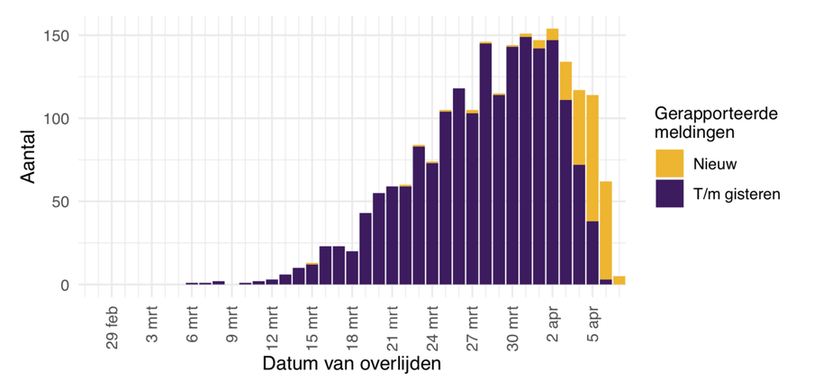
Here’s a translation of the terms in the graph:
- ‘Datum van overlijden’: date of death.
- ‘Aantal’: number.
- ‘Gerapporteerde meldingen’: reported cases.
- ‘Nieuw’: new.
- ‘Tot en met gisteren’: up to an including yesterday.
How to look at the figures
All of this already indicates that you shouldn’t get too caught up in the numbers you hear daily on the news bulletin. So much higher than yesterday, but lower than the day before; you probably know the drill by now.
And don’t get too carried away by these kinds of toe-curling YouTube videos where you can follow the development of the epidemic "live". Eek.

So how can you look at the figures without getting lost? Here are some steps that help me grasp them better:
- I don’t actually look at the number of cases or deaths because it’s known that it’s an underestimation, given that only positively tested persons count. Also, the testing policy in many countries has changed over time, so it’s difficult to estimate how big the discrepancy is.
- I mainly look at hospital admissions, especially the number of ICU beds occupied by corona patients. This depends on the country, obviously, but in a country like the Netherlands these are pretty hard figures that reflect how things are going. (One of the main goals of the current policy is to ensure that the healthcare system is able to cope. These figures show whether that goal is being achieved).
- I don’t look at the day-to-day figures, but I put them into perspective. Bar charts are shown on the websites of national health authorities, in newspapers and other sources reporting on corona figures. First, go back over the previous few days (as we saw, there is a delay in the figures), and then look at the trend of those figures. Don’t get bogged down by daily fluctuations, instead, look at the overall direction of the line you see.
#coronafree
And now on to the corona-free section of my newsletter. My colleague Maite Vermeulen shared in her Dutch newsletter the live stream of the Kruger Park in South Africa.
Each day (5:30-8:30 and 15:30-18:30 local time), you can follow rangers live as they drive through the park with a camera, or you can rewatch older videos. Watching sleeping lions from the comfort of my home — I love it.
Are you more into flora? The Amsterdam Hortus, one of the oldest botanical gardens in the world, recently started making video tours. The head of Garden & Collection, Reinout Havinga, walks through the garden and shows you what’s blooming. In the first episode: the magnolia.

Before you go...
...data journalist Nate Silver wrote an article about the influence of testing on the reliability of corona figures. Conclusion: counting cases says nothing unless you know how much testing is being done. But even then: the figures remain tricky.
 Prefer to receive this newsletter in your inbox?
Follow my weekly newsletter to receive notes, thoughts, or questions on the topic of Numeracy and AI.
Prefer to receive this newsletter in your inbox?
Follow my weekly newsletter to receive notes, thoughts, or questions on the topic of Numeracy and AI.