
Even if you’re not a numbers person, you can’t really avoid them these days. Every day you hear about new cases, about "flattening the curve", or about exponential growth.
This explainer gives you the most important numbers. What do the statistics tell us and what don’t they?
Where can I find the latest figures?
For a global overview of figures on the coronavirus (or Covid-19) – such as the number of confirmed cases – it’s best to look at data from the World Health Organization (WHO), the United Nations organisation that deals with world public health. They’re the authority on these kinds of figures.
The WHO publishes a daily "situation report" on the current state of affairs with collected and aggregated data from every country. Because the situation is changing rapidly, I won’t report those figures here. However, on Our World in Data – a kind of "data Wikipedia" with excellent explanations of the figures – you can find up-to-date visualisations of the WHO’s information.
It’s also good to know that the WHO’s data is always a little bit behind because the organisation collects its information from national health organisations. It doesn’t make much difference, but if you really want to know the latest state of affairs in a particular country, go to the website of the national organisation responsible for public health in that country. In the US, for example, that’s the Centers for Disease Control and Prevention.
If you want to understand the pandemic, the following four figures are important.

The number of confirmed cases
The first figure is the number of cases of coronavirus infections. To be honest, nobody knows how high this number is. If a media outlet talks about the "number of coronavirus cases", you can assume they’re being sloppy.
We only know the number of confirmed cases. The WHO and national public health organisations count the cases where a lab test has indicated that someone has the virus.
We can assume the number of confirmed cases is lower than the actual number of cases. For example, in the Netherlands, you don’t have to call your GP if you have mild symptoms. Some people who are infected hardly have any symptoms. But even in the case of more serious symptoms, you don’t automatically get tested so that enough resources and attention can be saved for people most at risk.
Another thing to keep in mind about these figures is that people recover. If you’re free of symptoms for 24 hours, you’re considered "cured". But even people who have tested positive – and are therefore included in the "number of confirmed cases" – aren’t necessarily monitored. If we take the Netherlands as an example again, there is no obligation to report when you’re cured. So it’s possible that a confirmed case remains on record even after the person has recovered – and the longer the pandemic continues, the more this will probably happen.

The mortality rate
The next important number is the mortality rate. This is often measured by the case fatality rate (CFR).

In order to calculate this ratio, you want to know both the number above and below the line. We saw earlier that the denominator – the exact number of cases – is unknown. That’s already one problem.
But the numerator – the number of deaths – is also unknown. Again, we only know the number of confirmed deaths. There’s good reason to believe that this is different from the number of deaths related to Covid-19.
For many patients, it is not (yet) clear whether they will recover because of the time between the first appearance of symptoms and death. In China, where the virus has wreaked havoc for a longer time, it is estimated that this period can be between two and eight weeks.
Based on Chinese data, there’s currently a rough estimate of a 2% mortality rate. In other words, according to this estimate, two out of 100 people with Covid-19 will die. But China has the same problems I mentioned earlier – every case of Covid-19 wasn’t reported, for example. So you should really take this figure with a pinch of salt. It’s way too early to give a definitive figure.
Lastly, the mortality rate can vary by moment, place and person because it depends not only on the virus but also on the context. What treatment will a patient receive? And, say, how old is the patient?

The rate of infection
To know how quickly the virus can spread, the "basic reproduction number" is important. This is also called R0 ("R nought") in virology: the average number of people that one sick person can infect. The R0 is based on a population where the disease first occurs and where people are not yet immune (because of a vaccination, for example).
R0 is an important number because if R0 is greater than 1, the virus is likely to continue to spread. If it is smaller than 1, then it is to be expected that the disease will peter out.
It will come as no surprise that this figure is also unclear in the case of Covid-19. All kinds of estimates have been made, with different methods, which roughly determine the R0 between 2 and 3. The WHO is more conservative with an R0 between 1.4 and 2.5.
By the way, it’s not that a larger R0 is necessarily worse. As science journalist Ed Yong explained: "Seasonal flu has an R0 that hovers around 1.3, and yet it infects millions of people every year. Sars had an R0 of 2 to 5 and infected just over 8,000 people." That’s because in the case of Sars, measures were taken to stop the infection.
It matters most to know whether the R0 is greater than 1, but exactly how much greater is not so important. Because the R0 is only an average. Suppose there’s a "super infector" that infects 100 people, compared to 49 people that do not infect anyone, then the R0 equals 2. This is a completely different scenario than when 50 people all infect two people, even though the R0 would again be equal to 2.
But perhaps the most important thing is: R0 is a hypothetical number. What ultimately matters is the R, the "effective reproduction number". This is the actual infection rate. By taking measures – quarantine, social distancing, hand washing – that number can be reduced. Ideally, R would then fall below 1.

The growth
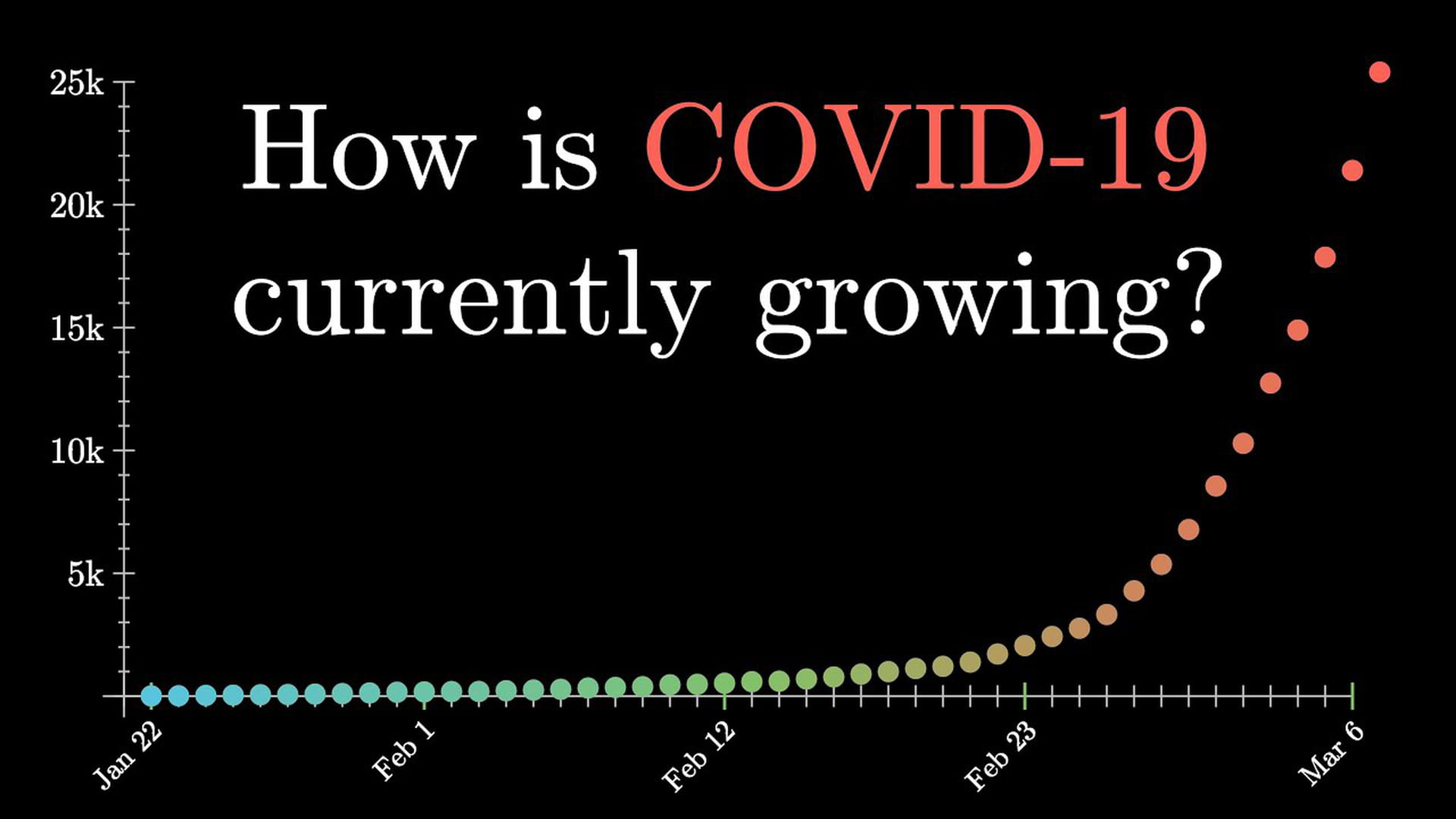
With the coronavirus, it’s not only important to know how many cases there are but also how fast that number is growing. If that number is multiplied by more than 1 every day, we speak of "exponential growth". So in a graph, you don’t see a straight line, but a line that becomes steeper and steeper.
However, this is not always visible in the graphs you see in the media now because the Y-axis is sometimes adjusted. They use a "logarithmic scale", which means that the vertical axis does not follow the normal structure – 10, 20, 30, 40 – but instead makes steps that get bigger and bigger because they are multiplied by a certain factor. For example, each step is multiplied by 10: 10, 100, 1,000, 10,000. If you see an out-of-control axis, it’s good to remember: something that grows exponentially looks like a straight line in such a logarithmic graph.
Another way of looking at this is the doubling time – the time it takes for the number of confirmed cases to double. Suppose there are 100 confirmed cases today, and we know that every two days the number doubles. The day after tomorrow we’ll have 200 cases. Two days later, 400. Ten days from today, we already have 3,200 cases. This is completely hypothetical, but it shows that a small number can grow quickly if it grows fast enough.
It’s important to look at the growth per country. Some countries, such as China, have been dealing with the coronavirus for a longer time, and growth also strongly depends on the measures a country takes. Our World in Data shows the doubling times per country. These indeed vary a lot. At the time of writing (16 March), some countries double daily, while a country like China only doubles every 34 days. (These figures are again based on confirmed numbers and, as such, are uncertain.)
China’s case shows that exponential growth does not continue indefinitely. At a certain point, growth levels off. Theoretically, this happens anyway because as more people become infected, there are fewer people to infect again. But, of course, it doesn’t have to get to that stage if preventative measures are taken.
That’s why we shouldn’t speak about exponential growth but about logistic growth instead. A line that initially grows exponentially for some time, but eventually flattens out. This video by 3Blue1Brown explains it in more detail.
Now what?
The data may be uncertain, but most experts agree on one thing: to control the outbreak of this virus, countries must take far-reaching measures. It’s not for nothing that schools have been closing, people work from home if possible, and you hear about "social distancing" everywhere.
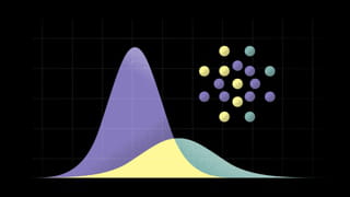
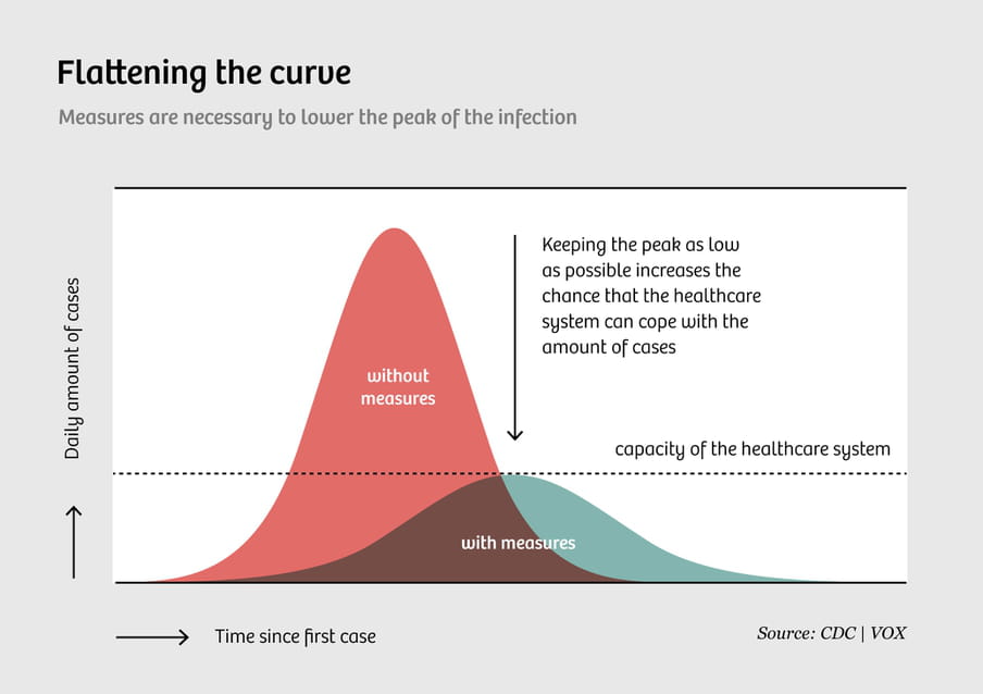
The reason for these measures is best summarised in a graph that went viral with the hashtag #FlattenTheCurve, which shows two curves of the number of Covid-19 cases: one without extra measures, one with. The first curve has a large peak, the other is flatter.
The message? If we take measures, we can temper the growth of the number of cases, which doesn’t necessarily mean that there will ultimately be fewer cases, just that there will be fewer cases at the same time. This is essential to ensure that the healthcare system is not overburdened. And, of course, let’s hope there is a way to reduce the total number of cases as well.
As you can see, there are no numbers next to the axes of this graph because it’s a fictitious situation. But the point still stands: let’s try to spread the virus as little as possible. The Washington Post has a wonderful simulation showing why social distancing can prevent the spread of the disease.
A few last tips
These are weird times, so it’s nice to be able to hold on to clear numbers. But unfortunately, the figures concerning the virus are uncertain. Scientific research is also constantly evolving, so we need to accept there is a lot we don’t know yet.
All kinds of figures and graphs about coronavirus are circulating on Twitter and other places. However well intentioned they may be, they sometimes come from people who may be good with computers but who do not have the substantive knowledge to make good predictions. So don’t trust those messages blindly and instead look to reliable organisations, like the WHO, and experts, such as epidemiologists and virologists.
Finally, of course it’s important to follow developments, but there really is no need to refresh your news feed all day. So Skype with your grandmother, play with your children, learn programming – whatever, as long as it has nothing to do with the coronavirus.
Oh yeah, and wash your hands.
 Want to stay up to date of my work?
Follow my weekly newsletter to receive notes, thoughts, or questions on the topic of Numeracy and AI.
Want to stay up to date of my work?
Follow my weekly newsletter to receive notes, thoughts, or questions on the topic of Numeracy and AI.
 Not a member of The Correspondent yet?
The Correspondent is a member-funded, online platform for collaborative, constructive, ad-free journalism. Choose what you want to pay to become a member today!
Not a member of The Correspondent yet?
The Correspondent is a member-funded, online platform for collaborative, constructive, ad-free journalism. Choose what you want to pay to become a member today!
Dig deeper
 Don’t forget: disasters and crises bring out the best in people
Disasters and crises bring out the best in us. This simple fact is confirmed by more solid evidence than almost any other scientific insight, but we often forget. Now more than ever, in the middle of a pandemic, it’s crucial to remember this.
Don’t forget: disasters and crises bring out the best in people
Disasters and crises bring out the best in us. This simple fact is confirmed by more solid evidence than almost any other scientific insight, but we often forget. Now more than ever, in the middle of a pandemic, it’s crucial to remember this.