

Imagine you take your toddler to the hospital. You’re worried. He’s been inconsolable for hours, and he’s burning up. You are all whisked off to an examining room and three doctors come examine your son.
- The first doctor says, “I have no idea if your son has a fever.”
- The second says, “His temperature is probably somewhere between 100 and 106.”
- The third states, “It’s 104. Your son has a high fever.”
Which of these people would you want treating your child? The scenario seems pretty clear-cut: the first doctor is totally incompetent, and the second is using a dubious guesswork method with a huge margin of error. It’s highly likely you’d choose the third.
But what if you lived in a world where thermometers were inaccurate, or even nonexistent? Would you want your child treated by a doctor who made decisive pronouncements based on information you couldn’t verify? Or would you choose a physician willing to admit they didn’t know exactly, or at all?
Statistics schmatistics
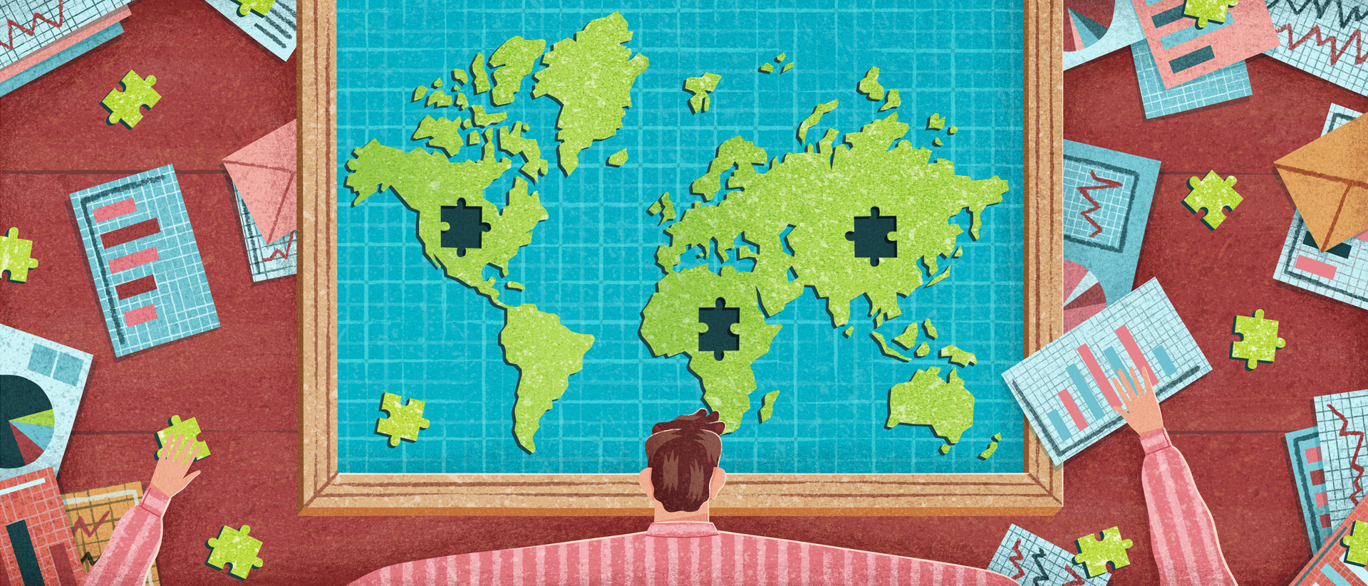
The world is doing well. The percentage of poor and malnourished people has fallen by half over the last 25 years. Africa – once the “hopeless continent” – is doing great: it can claim five of the world’s ten fastest-growing economies. We’re living in “the African century”; the continent is “the China of the future.”
At least, that’s what we think. This rosy picture is the product of data furnished by international organizations like the United Nations, the World Bank, and the International Monetary Fund. From child mortality to economic growth, deforestation to unemployment, name the phenomenon and they’ve got a table comparing rates country by country.
But there’s a big problem. When it comes to data from developing countries, all too often, the thermometers are useless. Whether you’re looking at economic growth, hunger, or poverty, the numbers are frequently inaccurate or simply nonexistent.
“Africa rising”
Illustration by Jacob Stead

When it comes to economic growth in Africa, in some respects, we know as little as Livingstone did going up the Nile. Figures are often absent, of poor quality, or contradictory. To understand why, you have to look at the source: the various national statistics offices. They’re charged with providing international organizations with data, but they’re hampered by a chronic lack of funding, staffing, and the knowledge necessary for collecting the required information.
In the book Poor Numbers, Morten Jerven recounts a visit to the Zambian statistics office in 2010. There, one man bore responsibility for calculating the national accounts, including gross domestic product (GDP). “What happens when I’m gone?” the Zambian official wondered aloud.
The cases of Ghana and Nigeria make the inadequacy of African growth data painfully apparent. In 2014, Nigeria updated the way it calculated GDP. It was about time: the country had been relying on statistical methods and systems dating back to 1990. Telecommunications and the Nollywood film industry, for instance, were still treated as small, yet both sectors had seen explosive growth in the ensuing 25 years. After the recalculation, Nigeria looked almost twice as rich. In fact, with a GDP increase of 89% over the previous year, it outstripped South Africa as the continent’s wealthiest country. That’s like the average Slovak suddenly becoming as rich as the average American.
Sometimes the World Bank estimates missing data using an unknown method. No one knows precisely what happens inside the black box, but eventually, the figures come out
Ghana had previously revised its figures and seen its GDP soar by an almost-as-impressive 60%. Both countries had modernized their methods, and that was good news. But the striking differences in results offered concrete proof that African GDP statistics could be of dubious quality. Were methods being used elsewhere even more sorely in need of improvement? How did things stand in nations less prosperous than Ghana and Nigeria?
It’s not just the quality of GDP figures that’s a problem; their timeliness is too. Procedures are so sluggish that national statistics offices often take years to release figures. This is particularly an issue for the World Bank, which wants current data, says Jerven.
Though not authorized to do so by any international agreement, the organization began publishing its own GDP data in the 1980s. Sometimes it bases its figures on trips to a country, where employees talk with high-ranking officials and obtain access to data others aren’t privy to. Other times, however, the World Bank estimates missing data points using an unknown method. No one knows precisely what happens inside the black box, but eventually, the figures come out. This data is then unquestioningly adopted by numerous policymakers and journalists.
As a result, the World Bank’s figures deviate from national estimates. The graphic below shows percentage differences between the World Bank’s GDP estimates and those of the countries themselves. For some nations, the figures are the same, but for most, the two estimates differ. The World Bank calculates Guinea-Bissau’s GDP at more than 40% higher than the country itself does.
Source: Poor Numbers by Morten Jerven
Comparing World Bank figures with those of two other authoritative databases, the Penn World Table (PWT) and the Maddison dataset, also reveals big differences. For instance, Maddison ranks Guinea as Africa’s seventh poorest country, while the PWT puts it just behind the continent’s ten richest nations. The World Bank lists Guinea in 15th place.
Extreme poverty “reduced by half”
“The world has reduced extreme poverty by half,” the UN wrote in its evaluation of the Millennium Development Goals in 2014. That meant one of the main targets, halving the percentage of people living below the poverty line, had been met.
But poverty statistics, like those for economic growth, are often unreliable. That’s because it’s extremely hard to determine how many people are living below the line. First of all, you have to conduct mass surveys, and administering and processing these questionnaires can take years. Botswana, for instance, conducted a survey in 2002–2003; but 13 years later, the data still hasn’t been published. Poverty estimates are still based on figures from 1994.
Illustration by Jacob Stead
On top of that, since countries design and carry out surveys in different ways, their numbers are hard to compare. Some measure income, for instance, while others look at how much a household consumes. The latter method is more suited to many developing countries, where incomes can fluctuate widely from month to month and purchases are often made in kind. Questionnaires also differ, for example in the number and wording of questions. These variables can have a big impact. In Tanzania, an experiment that used different methods came up with poverty estimates that varied from 47.5% to 66.8%.
Where national figures are available, they have to be converted and adjusted so they can be measured against the global poverty line of $1.90 a day. This is necessary because purchasing power varies between countries: $1.90 buys more in Thailand than it does in Brazil. To make these adjustments, you need other sources of data, which contain measurement errors of their own. So measurement errors accumulate, and the figures become more and more unreliable.
But not only is the soundness of the measurements questionable, the data often isn’t even available in the first place. Of the 161 developing countries the UN looked at, there was only enough information on hand to determine poverty trends for 84 countries – that’s just 52%. The World Bank – from which the UN gets its poverty figures – solves the problem of missing data by filling in the holes: it assumes a country’s poverty trend will continue in the same manner, or that it’s the same as it is elsewhere on the continent. But the poorest countries are the ones that have the hardest time collecting data, which means it’s easy to form an unduly optimistic picture of global poverty.
Hunger “has declined” since 1990
Another key UN goal is ending world hunger. One of the millennium targets was to cut the percentage of undernourished people in half by 2015. In May of that year, the Food and Agriculture Organization (FAO) published its annual report “The State of Food Insecurity in the World,” also known as SOFI. The most important findings: the number of undernourished people in the world had dropped to 795 million, and hunger had declined in 72 of the 129 countries mentioned in the report. In all developing countries combined, the percentage of people going hungry fell from 23.3% to 12.9%. A halving of the figure to 11.7% was therefore not quite achieved.
As with GDP and poverty statistics, data availability and quality make malnutrition figures problematic. But how concepts are defined also makes a big difference. The case of hunger serves as an example of how varying definitions can dramatically change data patterns.
In 2012, the FAO decided to change the way it measured hunger and retrospectively recalculated its statistics back to 1990. First, it adjusted the formulas used for computation. Second, it switched to better data on matters such as food supply and population figures. For instance, new estimates indicated 25 million more people had lived in China in the 1990s than was assumed in the original calculations.
The new methodology dramatically changed the view of hunger. Suddenly, it turned out 150 million more people had gone without enough food in 1990 than was previously thought. Though the old data had shown an increase in the number of undernourished people over the past 20 years, the new figures indicated a steep drop. The UN’s target had seemed a distant dream, but after the change in method, voilà: the goal was within reach, according to the FAO. Since things in 1990 had been much worse than thought, it said, more progress had been made than previously assumed.
Source: UN Food and Agriculture Organization
Even if you accept the new methodology, there are other factors affecting whether or not progress can be said to have been made. For one thing, what exactly does the FAO mean by hunger? It defines a person as undernourished if he or she consumes too few calories for a year. A minimum calorie intake is determined for each country on the basis of average height, age, and sex. In calculating it, the FAO assumes people have a “sedentary lifestyle”: that is, they spend their days in a cubicle or someplace similar. In fact, though, poor people in developing countries often do physically demanding work. According to the guidelines, someone in Uganda needs at least 1,710 calories a day. That might be enough for a Victoria’s Secret model, but not for a hardworking Ugandan farmer.
Up the calorie limit slightly and the hunger pattern suddenly looks very different. If you assume people are living moderately active lives, then there are as many people without enough to eat today as there were in 1990 (see graph). If you suppose more intense activity levels, that means there are even more.
And the UN doesn’t look at absolute numbers but at the global percentage of undernourished people, which changes the picture again, making it look a lot more positive, since the world’s population has grown. But the choice between percentages and absolute numbers isn’t straightforward: After all, it doesn’t help a starving person to know he or she has become a smaller part of the whole .
Source: UN FAO, 2012
A picture blurred by false certainties
Are poor countries prospering? Is Africa rising? Have poverty and hunger halved? Those are the claims, and they could be true, but the reality is, there’s a lot we don’t know. Too many figures are unreliable, outdated, or simply nonexistent. That doesn’t mean we should give up trying to get accurate data. Though whoever said “Not everything that counts can be counted” (often attributed to Einstein) had a point, we still need reliable figures to make things better in developing countries.
Illustration by Jacob Stead
Fortunately, there are bright spots. Data collection has improved significantly in the new century. In 1990, for instance, poverty data was available for just 22 developing nations. The figure has since risen to 127. Statistics offices have gotten better at what they do, partly thanks to investment by international organizations such as the World Bank. And new technologies like satellites and mobile phones have made it easier to gather sound data.
International organizations are being more frank about the quality of their figures, too. If you examine the reports, you come across plenty of caveats. For instance, the Millennium Development Goals report cautions, “Despite considerable advancements in recent years, reliable statistics for monitoring development remain inadequate in many countries.”
The World Bank writes, “Many statistical offices, especially those in developing countries, face severe limitations in the resources, time, training, and budgets required to produce reliable and comprehensive series of national accounts statistics.” And the FAO acknowledges in its 2015 report that its indicator is based on a narrow definition of hunger, which is why it uses a set of food security indicators to create a more representative picture. The organization also measures iodine deficiency in populations and the percentage of underweight children.
But such mentions of limitations and and nuances are often buried in footnotes and appendices. When you get down to it, international organizations appear to be ignoring the gravity of the situation. This is painfully obvious in the UN’s new development goals. Now, developing countries will have to measure 169 different indicators.
That seems overly ambitious – even though the corridors of the UN are abuzz with talk of a “data revolution.” After all, collecting sound data for the previous 48 indicators proved impossible. Less than 70% of the information needed was available, and half of that consisted of estimates, since national data was lacking.
Meanwhile, international organizations seem to be acting as if the hypothetical thermometer is working just fine – and able to read your blood pressure and take your pulse, too. It’s not their fault the data’s sketchy; getting hold of accurate figures in developing countries is difficult. But international organizations – along with journalists and policymakers – should be forthright about the shortcomings instead of blurring our view of the world with false certainties.
— Translated from Dutch by Laura Martz and Erica Moore
More from The Correspondent:
 Poverty 101: How can we end global poverty once and for all?
By 2030 the world must be free of extreme poverty. The question is how? Of course there’s no single answer. In this crash course on global poverty, we bring together as many answers as we can. We’ll look at the extent of the problem, the causes, and possible solutions.
Poverty 101: How can we end global poverty once and for all?
By 2030 the world must be free of extreme poverty. The question is how? Of course there’s no single answer. In this crash course on global poverty, we bring together as many answers as we can. We’ll look at the extent of the problem, the causes, and possible solutions.
 This is the Berlin Wall of our time
Syrian refugees continue to flee the country in droves, but a solution to the conflict there remains elusive. Why? The answer may seem surprising, but our greatest obstacle on the road to peace in the world could well be veto rights in the United Nations.
This is the Berlin Wall of our time
Syrian refugees continue to flee the country in droves, but a solution to the conflict there remains elusive. Why? The answer may seem surprising, but our greatest obstacle on the road to peace in the world could well be veto rights in the United Nations.
 The bizarre tale of President Nixon and his basic income bill
In 1969 President Richard Nixon was on the verge of implementing a basic income for poor families in America. It promised to be a revolutionary step – had the President not changed his mind at the last minute. This is the incredible and largely forgotten tale of just how close the U.S. came to stamping out poverty altogether.
The bizarre tale of President Nixon and his basic income bill
In 1969 President Richard Nixon was on the verge of implementing a basic income for poor families in America. It promised to be a revolutionary step – had the President not changed his mind at the last minute. This is the incredible and largely forgotten tale of just how close the U.S. came to stamping out poverty altogether.
 The world’s not changing faster than ever at all
The world is changing faster than ever. And we’re going to have to adapt faster than ever too, just to keep up. At least that’s the cliché. But a new book gives short shrift to that notion. We’re not living in a period of technological revolution after all, author Robert J. Gordon argues, but in a period of technological stagnation.
The world’s not changing faster than ever at all
The world is changing faster than ever. And we’re going to have to adapt faster than ever too, just to keep up. At least that’s the cliché. But a new book gives short shrift to that notion. We’re not living in a period of technological revolution after all, author Robert J. Gordon argues, but in a period of technological stagnation.