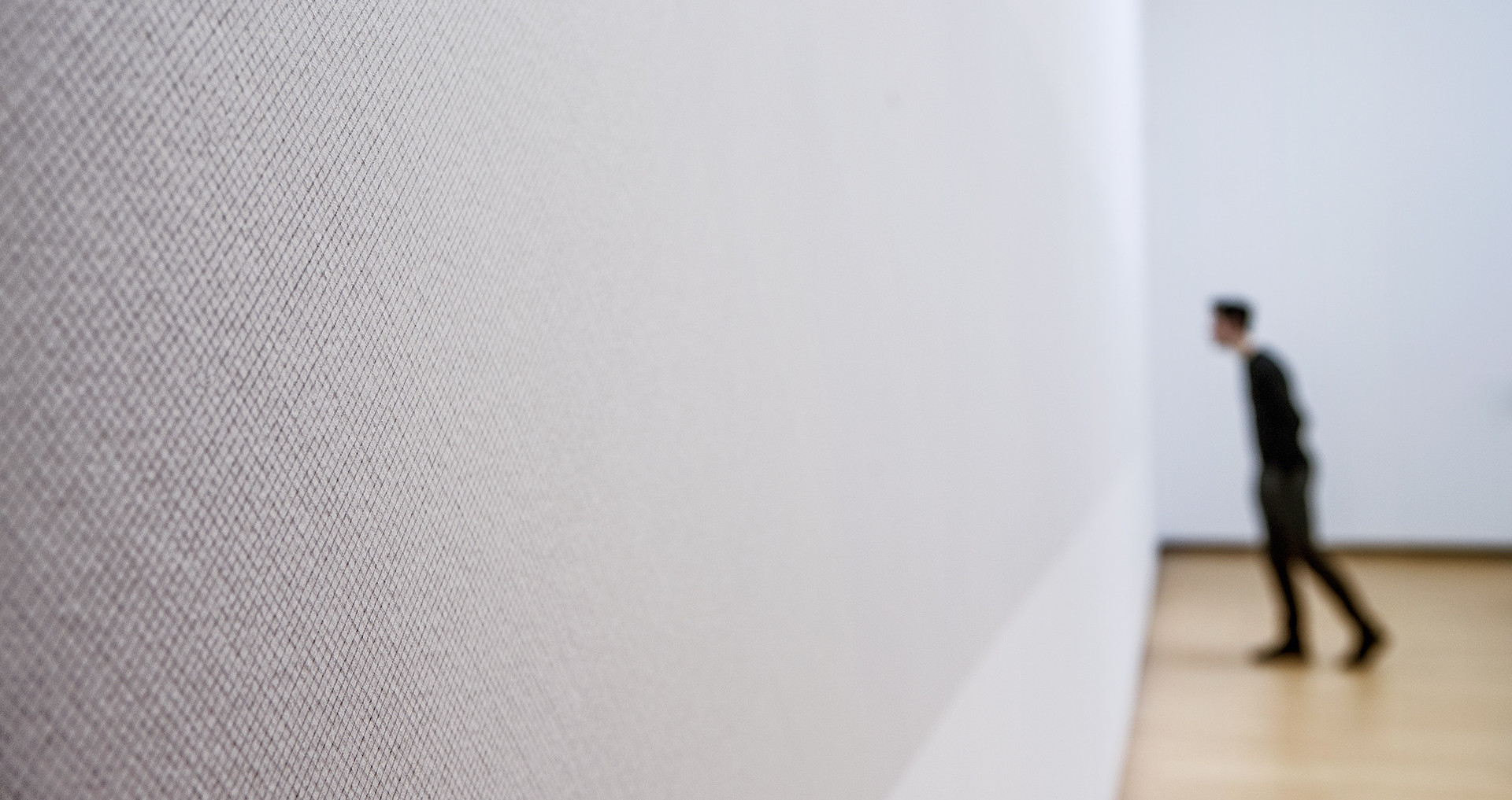
This February, the Stedelijk Museum in Amsterdam invited me to put together a personal audio tour of the galleries and to host a special evening program. In selecting ten works for this tour, I was made to examine my own experience of the museum – and in the process, to examine myself.
For me, the power of art is that it asks you to reflect on other people’s creative choices. Beyond the works displayed in the museum, I’m also fascinated by the building itself. It’s a setting perfectly attuned to the experience of creativity. Precisely this quality makes it an inspiration for me in designing digital platforms for others. Standing here, you wonder: Which choices did these artists and the architect dare to make?
The museum affords me a calm space where I can focus on the works of others. This is an idea that ties in seamlessly with our approach at Momkai and De Correspondent. In the fragmented real time of digital media, we are bombarded by images and messages non-stop. Rarely do we tune out this background noise long enough to listen attentively to a single, solitary message. Our mission therefore, as I see it, is to create online spaces of calm.
The design philosophy of cultivating calm
But how? The project at the Stedelijk Museum was an incentive to put the principles underpinning our designs down “in writing,” in hopes of offering handholds for our team, insight for you, our readers, into what we are trying to do, and inspiration for other digital designers.
But first, some practical info. Above is an audio recording (in Dutch) of my talk at the Stedelijk Museum to launch the audio tour. In it, I explain my design philosophy of cultivating calm. For once, I didn’t use a single image or design to illustrate my presentation – making it perfect podcast material. The introductions were provided by our podcast correspondent Lex Bohlmeijer and by Karin Sommerer of the Stedelijk Museum.
Prefer to read? Below, I outline my philosophy for designers in English.
The foundation: a rich platform that exudes calm

A design in which it’s clear how all the elements fit together takes your user by the hand. From the outset, your goal is to create a design that gels, that’s coherent. What you see and what it does form a unified, immersive, and wholly unique experience, generating recognition and authority. Users feel reassured: you can see where you are and how to interact online. You have a basis of trust and a foundation to build on.

Don’t make work more complicated than it is, and don’t leave loose ends. Cherish the details: they are what pull you into the narrative. Remember that the design is a vehicle for the message; your objective is to get that message across loud and clear. Strength lies in simplicity.

Insight starts with understanding – a better understanding of the world around us. Every design requires a firm foundation of research. To get information across, you need to be informed. If you don’t furnish the context, you’re only designing confusion.
The approach: the calm to catalyze

Making strides is a matter of stopping to plot your course. Focus and selection define not only the design process, but also for whom and with whom you work. Think first about whose message you want to send. And if you believe in something, be bold enough to give it all the time, talent, and resources you’ve got.

Facing change with confidence works best if you guard your investments. Protect the talents of your team by making firm agreements in advance about approach, method, and ideas. Ground rules help others to play the game and help guard against foul play.

Every perspective that’s different from your own expands your horizon. And that’s vital. An open mind paired with an abiding curiosity engenders a design calibrated to the user. As well as connecting with users, you inspire your team to strive beyond itself.
Growth: the calm within the storm

No design is ever finished. It’s always changing and evolving in step with your users. And nowhere more so than in the digital environment, with its merry-go-round of screens, devices, and new services. Be enterprising and tap into that growth. By developing for the long run, you enlarge the impact.

Designs are never static. They are augmented and expanded by users. The trick is to build in playing fields that let them do so. You’ll learn what works, what doesn’t, and discover where changes can amplify the experience. Don’t make your design an end point, but let it pave the way.

Master the formula in order to let it go. Have the courage to think big and to work small, to dive into the details. Explore everything, including your own abilities, and your designs will be fresh and unexpected, surprising even you.
— English translation by Elizabeth Manton and Erica Moore
More from De Correspondent:
 Join me on a tour of the Stedelijk Museum
The Stedelijk Museum in Amsterdam invited me to put together a special audio tour of designers and artists that strike a personal chord. A recurring theme, both in the tour and in my work, is “cultivating calm.”
 English speakers: Listen to Weval’s alternative audio tour
On Friday, February 5, I hosted an evening at the Stedelijk Museum to launch my audio tour. Among my guests on stage was Weval, a duo whose electronic music is cinematic and sophisticated. I find myself reaching for their music whenever I really want to tune in and focus on creative work. When designing, but also when looking at the creations of others in galleries or museums. Especially for those of you for whom the Dutch audio tour remains inaccessible: be sure and check out this alternative musical tour.
 Want to cultivate some calm on Facebook?
Check out “I Need My White Space,” a Facebook page that posts solely blank images. The idea may sound a little strange, but it offers an interlude of calm in an otherwise crowded timeline. Like the page to receive their blank updates.


